This article originally appeared on the Prime Design Solutions website.
Table of contents
Related articles
(The audio for this podcast is no longer available, but it is summarized below.)
You don’t have to be a professional photographer or own an expensive DSLR to take great photos. In this podcast, we’ll go over how you can use your smartphone to practice photography techniques that will enhance the quality of the images you post and really improve your social media presence.
These basic rules of creative photography can literally make one photo that contains identical elements into two, completely different-looking images.The seven composition rules that add appeal and interest to a photo are cropping, framing, backgrounds, rule of thirds, creative angle, leading lines, and symmetry/patterns. Let’s start with the simplest.
Cropping
Cropping is exactly what it sounds like and is a common way to enhance a photo. If your subject is lost in a distracting background of miscellaneous elements, crop some of it out. Remove whatever you can that’s taking the attention off the subject of your image. Sometimes, less is more.
However, less is not always more. Cropping too much of a photo can make it too small, resulting in grainy, pixelated images. It also becomes a problem when you crop too close to the subject of your photo —sometimes a distracting background is less of a problem than trying to remove it completely. There’s something to be said for leaving space.
Keep in mind that the proper way to crop an image varies, depending on what your photo is. There are different rules that apply to different subjects like humans, landscapes, portraits, etc. Be aware that not every image needs to be cropped at all. It’s only necessary in certain instances.
Below you find two photos of the same flag taken at the same time. The first photo is cropped too close, excluding elements from the second photo that make the shot more interesting and pleasing to look at. The second photo is also following the rule of thirds, another technique we will explore in this article.

Framing
Framing is exactly what it sounds like. Imagine a photo inside of a picture frame — the frame adds definition and interest to what’s being displayed. The only difference when shooting is that you’re using natural elements of the surrounding area to frame the shot. For example, let’s say you’re taking a picture of a lake. If possible, use the trees surrounding the water to fill both sides of the lens, creating a frame effect with natural elements. It’s a subtle technique that adds interest to a plain photo of a lake.
Below, you can see that framing is a simple technique that simply adds a little dimension to your photo. It does not necessarily make the photo better, as other techniques do. It does, however, add a nice touch to the image, given you have the necessary elements available for your shot.

Background
The background of an image can either make or break that photo. Exclude distracting elements if you can, and include interesting elements if available. If you’re taking a close shot of an insect, don’t take it on the ground in the middle of the woods. The leaves and brush will make it nearly impossible to get a decent shot of the insect. To see the complex structure of an insect, you need a simple background. A lady bug on a plain green leaf provides the contrast needed — both in color and background — to help the viewer get a better look at the lady bug.
If you’re shooting a cool building, or any architecture for that matter, make sure that one person standing way off in the background isn’t in the shot. It’s way more distracting than you realize and can ruin the entire composition of the photo. Believe it or not, multiple people in the background of a photo is less distracting than just one.
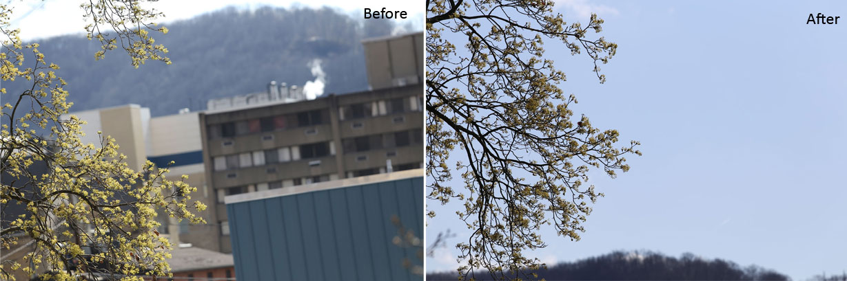
Refer to the images below to see how drastically different the right background can make for the same shot of a blooming tree. By eliminating the distraction of cluttered buildings and capturing the sky instead, the viewer is able to focus on the details of the buds. It’s almost impossible to tell that these shots were taken at the same time and of the same tree. The background can either make or break a good photo.
Rule of Thirds
A common misconception when taking a photo is that centering your subject, which is a natural instinct, will result in a good photo. But centering your subject is not the best way to take an interesting photo. The Rule of Thirds is to imagine that your frame is divided into nine equal segments — imagine a grid made with two vertical and two horizontal lines, like a tic-tac-toe grid. When you shoot, try to position your subject along one of these lines or at the point of intersection. By doing so, your subject will not be positioned directly in the middle, as the vertical lines are placed on 1/3 of the left or right of the photo. Therefore, your subject will appear more to the left/right/top/bottom part of the image. It’s a difficult concept to understand without a visual guide, but try it next time you take a photo. It makes much more sense when you’re looking through the camera.
The images below demonstrates that our natural instinct to fill the frame and center our subject is not ideal. By placing our subject (the bridge) to 1/3 of the frame, we are still drawn to the focus of the photo, while not limited to include more of the surrounding elements, making the image much more pleasing to look at.

Leading Lines
When we look at an image, our eyes naturally tend to follow lines, given they are present. Leading lines is a technique that affects our perception of a photo and of the subject. By capturing the lines in a certain way, we can draw our viewer’s attention toward the subject, using the lines as a guide that takes the them through the image to get there. These lines can be straight, diagonal, zig-zag, or radial, so long as they are on their way to particular point of the photo. Imagine a photo of a park — the leading line is the sidewalk and where it’s taking visitors. Picture yourself standing on a bridge — the leading line is the river and where it’s flowing.
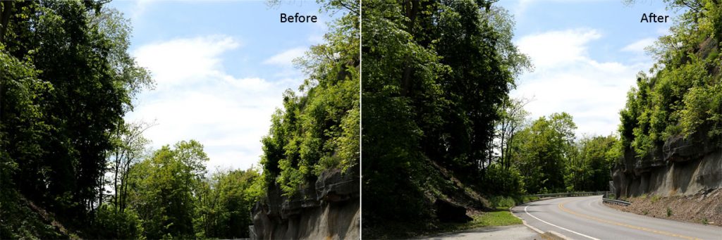
Notice the first image below, it’s rather plain and straightforward, though it does demonstrate the framing technique. Now, look at the second photo. By including the road, you’re not only making this shot worthwhile, but helping your viewers to navigate through the entire image. Leading lines is one of the simplest techniques to enhance any applicable shot.
Creative Angle
Creative angle, sometimes referred to as viewpoint, is the perspective from which you shoot. Will your shot be straight on, from below, above, or the side of your subject? This technique has the ability to truly enhance a photo by adding dimension and appropriate effect to the composition, depending on your subject.
For example, let’s use a photo of the Empire State Building. A straight shot from eye level of such an extravagant and enormous structure would not do this photo justice. In order to adequately capture the magnitude of this building, take a shot from the lowest position you can achieve, shooting upward to capture the building from ground level to the top. This angle will make the building appear more majestic, while helping viewers grasp its scale. That’s the shot that will turn heads. You are standing by an incredibly huge skyscraper and you want your viewers to feel that intensity. A photo that scales the building from bottom to top will add this effect to your photo, while the leading lines guide your viewers eyes through the image.
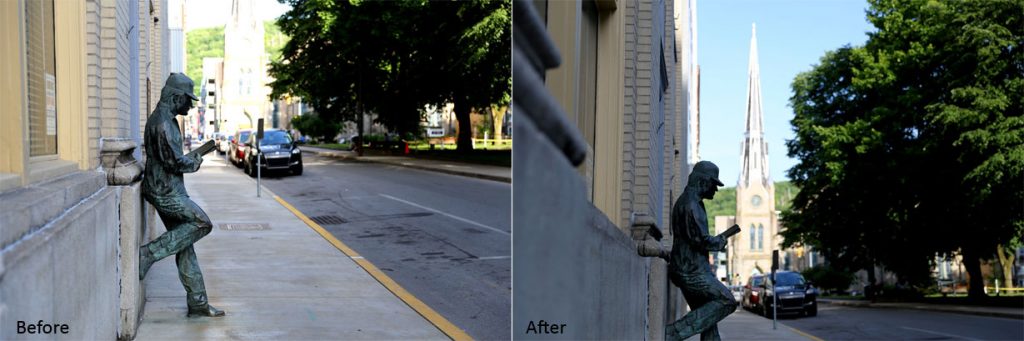
The photos below are another example of two shots that were taken from the same spot at the same time. The first photo was taken straight on from eye level. The second photo was taken from a lower angle, with more of a left alignment, which improved three things: the background, the emphasis, and the lighting. The photo is more interesting, a little more mysterious, and overall more interesting to look at upon first glance.
Symmetry or Patterns
This technique is fairly straightforward. Whether man-made or found in its natural element, we are surrounded by symmetry and patterns. Buildings are a great way to imagine symmetry: picture the front of a house – two windows and a door. Including symmetry into your photo can make the image more interesting simply by capturing the pattern itself, or introducing a focal point elsewhere in the shot that breaks the pattern. The element that breaks the pattern will immediately shift our viewer’s attention to what’s causing a disturbance in the photo, thus directing our focus to what the photographer wanted us to see first.
Both photos below demonstrate symmetry found in a man-made structure. The second photo presents the element that breaks the symmetry, which is the building in the right of the image.

Conclusion
Next time an Instagram or Facebook photo opportunity presents itself, try implementing one or two of these rules into your shot. It’s easy to recognize the difference between a standard photo, compared to one that integrates some of these simple yet highly effective compositional techniques. These are just a few of many different ways to enhance the appearance and interest of what you’re posting — without investing in a degree in photography.
